Hi Everyone,
Work is progressing preparing for the transition from the current MacScripter.net (which I refer to as MacScripter v1) to the new Discourse-based forum (MacScripter v2).
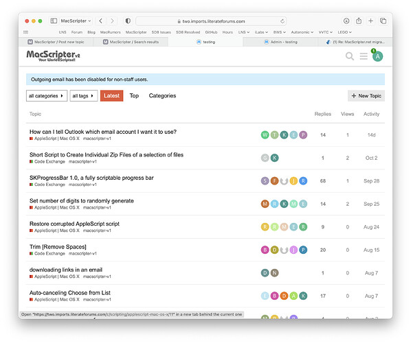
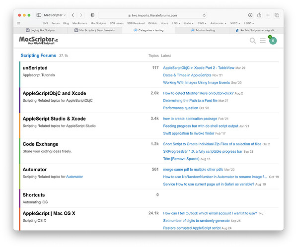
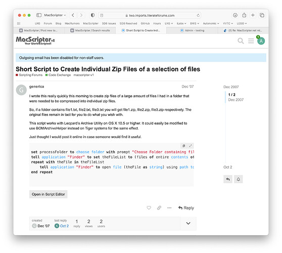
Here are some examples of how the new site is going to appear.
Latest Posts:

Categories:

A Topic:

If someone would like to help design better branding images, please do. I just copied the existing design without the blue gradient background.
I need three images, in both light and dark mode variants:
- Site Image appearing in the top left header (Discourse limits us to a branding image overlayed on the light or dark theme background):

- MacScripter Post Identity:

- Site Favicon:

NOTE: The font Ray used for the existing branding is ITC Bauhaus.